
Crash games feel built for the way you already use a phone. You open an app, you see one clear screen, and you know what to do inside five seconds. You tap, you watch, you tap again. The loop feels clean, and it fits into a spare minute the way a puzzle game does while the kettle boils.
That design choice matters. Action films pace tension by stretching a moment, then cutting at the peak. Crash games pace tension by giving you a tiny drama on repeat, then letting you decide when the scene ends. It feels a bit like that red button in Lost, where the whole point sits in timing, routine, and a decision you own, even when the outcome still holds mystery.
One screen, one job, one rising line
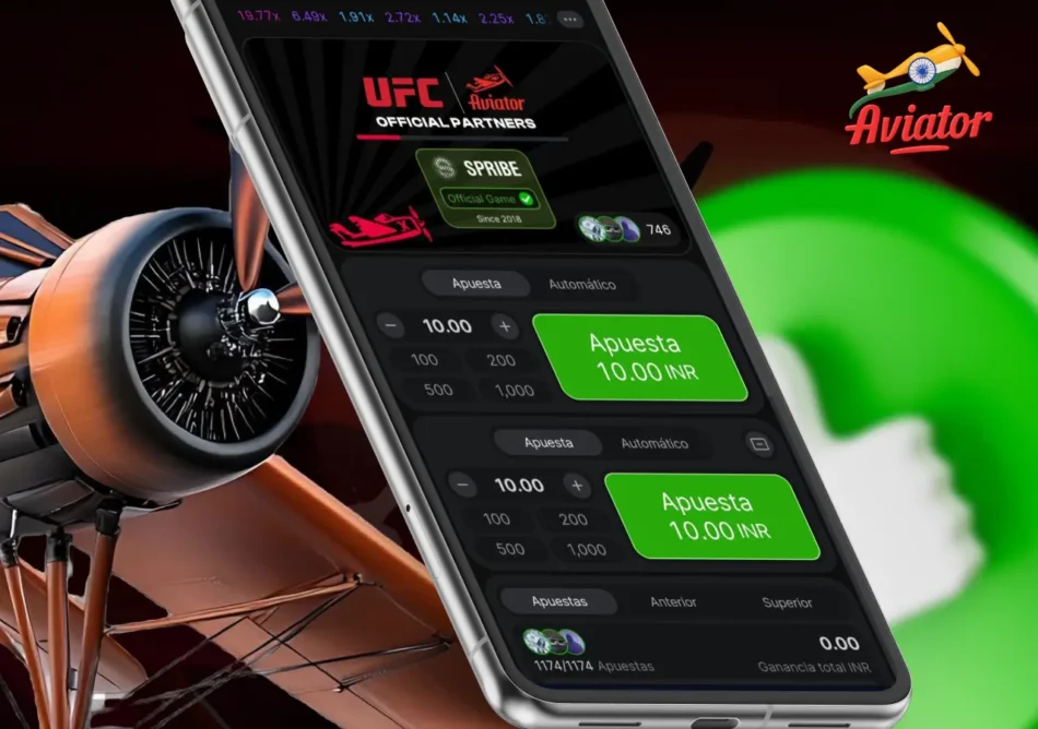
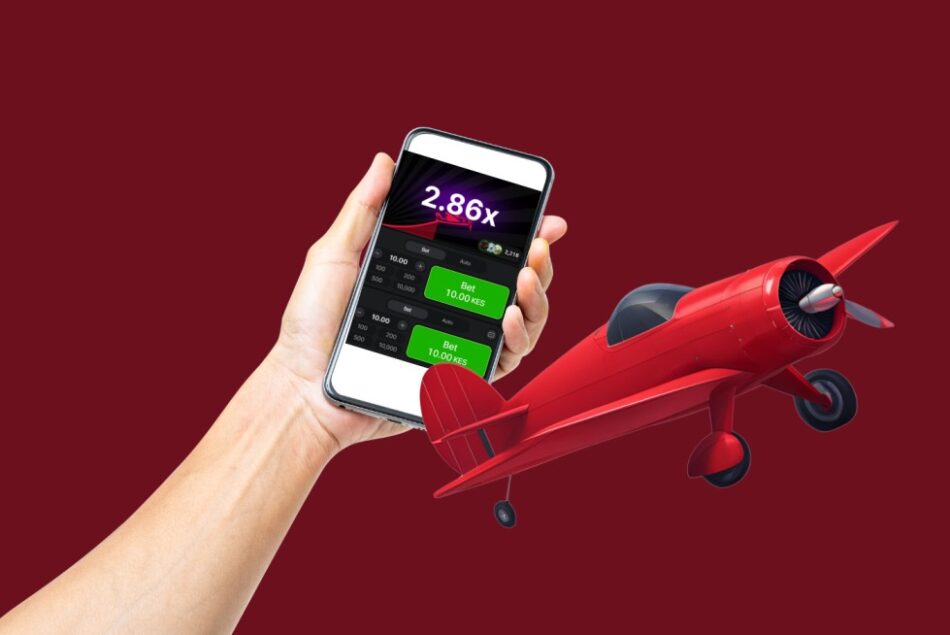
The Aviator game keeps the interface spare. The game shows a plane, a rising curve, and a multiplier that climbs as the round runs. You choose your stake, then you watch the number rise. You tap cash out when the moment feels right.
That is also why Aviator fits mobile habits so neatly. People scroll and tap all day, so a game that uses big targets and one primary action feels natural. In Aviator, you can play the popular crash game Aviator on platforms like Betway, and that familiarity of mobile patterns does a lot of the teaching for you.
Simple UI follows the same rules mobile designers use
Mobile game designers talk about cognitive load in plain terms. Every extra choice asks for mental effort, and effort burns attention fast. UX research from Nielsen Norman Group frames the idea in a simple way: people handle tasks better when interfaces cut “noise” and keep essential information in focus.
That principle shows up in Aviator’s layout. The multiplier stays front and centre, so your brain tracks one number rather than hunting across a dashboard. The plane animation gives the number a story, which helps you feel progress even on a small screen. The movement also reads with a hint of 3D depth through scaling and motion cues, so it feels physical in your hand rather than flat data on a spreadsheet.
Touch design research also backs the “big button, fast tap” approach. Fitts’s Law describes a basic relationship: bigger targets make faster, easier taps. Nielsen Norman Group explains how that plays out in modern UI work, with larger targets reducing errors and speeding interaction. Aviator’s cash out control fits that logic, since the whole game hangs on a tap that needs to land cleanly.

Instant feedback makes the loop feel alive
Mobile games keep you engaged by answering your actions right away. Tap, get a response. Swipe, get a reaction. Aviator does the same thing. The number climbs instantly, the plane keeps moving, and the screen updates in real time. The game also shows other players’ bets and cash outs in many versions, which adds social feedback on top of visual feedback.
Fast feedback also works because it lines up with reward learning. A variable outcome schedule keeps attention high because each round can land in a different place. You see the curve climb, you feel the urge to hold on, and you also feel the pull to lock in a result. Research and policy discussions about game reward systems often point to variable ratio reinforcement as a driver of persistent engagement, since the next try always feels like it could matter. The Australian Parliament report on gaming micro transactions discusses variable ratio schedules and describes their persistence effects in gambling style systems.
Aviator also leans on sound and motion to make feedback feel bigger than pixels. Sound research on slot style play shows that sound can lift arousal and change how outcomes feel, measured through skin conductance and self report. That finding offers a useful lens for fast games that use audio cues to sharpen the moment of decision.
Daily routines come from design
Mobile games often push daily returns through streaks, timers, and small rewards that feel easy to collect. Academic work mapping mobile engagement tactics notes common tools such as daily log in rewards and push notifications that prompt repeat play. That pattern shows up across the mobile economy, since habit beats intention when life gets busy.
Habit research helps explain the rhythm. A large, well-cited UCL study tracked how long daily behaviours took to become automatic, and it found that habit strength rose with repetition and then levelled off, with an average around 66 days in their sample. That finding matters for games, since a short daily loop can settle into a slot in your day even when you never planned a “routine.”
Aviator’s short rounds fit that daily pattern. You can drop in for a few cycles, read the mood of the room, then move on. The plane graphic helps here, since it turns time into a simple visual you can “feel” quickly. That is the same comfort mobile players get from a progress bar, a charging icon, or a streak counter.
Making the mobile style loop work for you
The Aviator game feels simple, which makes it easy to treat casually. That is also why a little structure helps. You can keep the fun and keep your choices deliberate by bringing the same habits you use for other phone games.
- Pick a clear session window before you start, like a short break between tasks, then treat the end time as part of the game. You can feel more in control when you decide the shape of play first, since Aviator’s pace can pull attention forward one round at a time. Habit research shows repetition in a stable context builds automatic behaviour, so a chosen context can keep the loop predictable.
- Use the interface as information rather than prophecy. Watch how the multiplier climbs and how other players cash out, then treat that as crowd mood and timing practice.
- Let automation serve clarity. Auto-cash out can turn a stressful tap moment into a planned rule. A planned rule can make the experience feel closer to mobile game “settings” than a live reflex test.